
Listen to the whole story here:
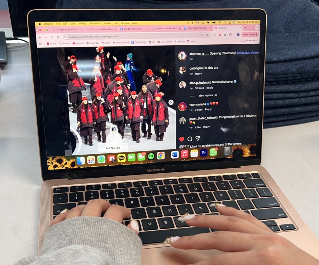
As Team Canada goes for gold at the 2026 Winter Games, Vancouver-based athletic brand Lululemon faces backlash for its opening ceremonies look, which has been compared to oven mitts, with their deep red oversized vest with a stylized maple leaf in front.
Two-time Olympic silver medallist, eight-time Canadian champion and now, an Olympic coach, Brian Orser described his first impression of the Lululemon-designed as “pretty avant-garde” and “very progressive.” He called it “brave,” especially for a country he says is typically conservative in its Olympic style.
“I thought it would be one of those things that, at the games, people are going to want to trade for,” Orser said, pointing to an Olympic Village tradition: trading national team gear and pins.
“When you’re trading outfits, you don’t want just another ski suit,” he explained. “You want something a bit different.”
While the collection may not be the prettiest compared to other countries, Henry Navarro emphasized that the big maple leaf and colour palette clearly identify Canadian athletes. “No one will mistake them,” the fashion professor at Toronto Metropolitan University said.
Uniforms can also shape confidence. Orser reflects on carrying the Canadian flag at the 1988 Winter Olympics opening ceremony in Calgary. He described the Western-inspired coats, fringe and cowboy hats.
“At first, people probably thought it was hideous,” he said with a laugh. “But when we were all together, it felt incredible.”
He emphasized that the sense of collective pride outweighs the criticism from the outside. “Even if we think the outfits are horrendous, when athletes walk into the opening ceremony, I bet they feel amazing.”
Navarro described the uniforms as “well executed in terms of practical functionality” and praised their ability to accommodate diverse body types. He added that the construction and materials demonstrate Lululemon’s expertise in high-performance apparel.
“What constitutes Canadian identity is very hard to define. Canada is a very diverse country, both in terms of the cultural differences among provinces and territories and because of the country’s varied populations and complex history,” Navarro added. However, he applauds Lululemon for “breaking the habit of limiting the colour palette of red and white.”
Lululemon revealed that the design is “driven by athlete insights and features innovative thermoregulation, new adaptive and inclusive features, inspired by Canada’s natural environment.” For two years, the brand specifically designed the clothing with athletes across Canada to really understand their needs for their games.
According to Lululemon, their design highlights included:
Despite the positives, Navarro said he believes that the company could have pushed further by experimenting with stronger silhouettes and bolder graphics. He suggests future Olympic collections include deeper collaboration, including partnerships with diverse artists and First Nations creatives to strengthen symbolism.
Olympic uniforms serve multiple audiences: to designers, they are cultural statements; to audiences, they are aesthetic and to athletes, they are confidence.
As Orser described, the real test of a uniform is not how it looks on television, but how popular it is in the village.
For Orser, team apparel goes beyond the opening ceremonies. He explained that athletes receive boxes of gear, socks, gloves, sweaters, watches and more. In his experience, the athletes never end up wearing the personal clothes that they packed.
“You bring a suitcase of your own clothes, and you don’t wear any of it,” he said. “All you wear is the team gear.”
In producing this story, I used Otter.ai for transcription.